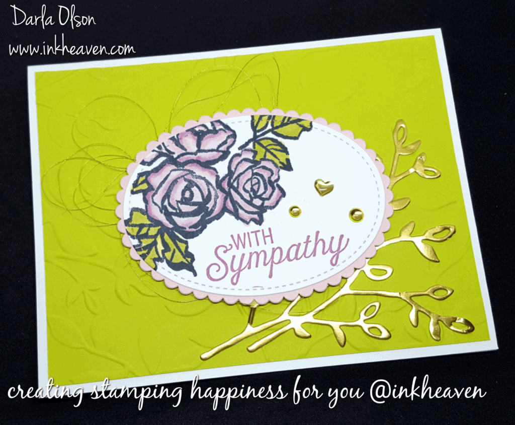
Handmade Sympathy Cards Are Always In Season
Creating sympathy cards during the Christmas season is not my favorite thing. However, since I needed one for the family of a very special stamping friend, I went to work creating one that I knew my friend would have loved.
Because the Petal Palette Bundle does not have any sympathy sentiments or verses, I did have to pull out another stamp set for those. In the end, I chose Flourishing Phrases. I also pulled in the Layered Leaves Dynamic Textured Impressions Embossing Folder to add a foliage texture to the background.
Choosing a Color Scheme For My Sympathy Card
I knew that I wanted my card to be bright and cheerful because my friend was full of pluck. Furthermore, she always wore a big smile in the face of adversity! Since I was not feeling too creative when I started, I went with a color scheme that I had used before and had recently came across going through my card stash (well, the one that is not packed up in a moving box somewhere, anyway).
The color scheme is Whisper White, Lemon Lime Twist, Pink Pirouette, Sweet Sugarplum, and Gold. The color scheme ended up being perfect. Consequently, I was able to weave some symbolism into each part of the card which ended up fueling my creative juices! Here are the symbolism’s that I wove into the card:
- The Lemon Lime Twist gives a bright and cheerful background to the card that reminds me of her big smile.
- The softness of the Pink Pirouette speaks to the kindness of my dear sweet friend.
- The gold allowed me to use the Gold Metallic thread to represent how she added richness to the tapestry of my life.
- The Metallic Enamel Shapes represent two things; the heart represents how much I love her, and the other represent my tears.
Blending With The Stampin’ Blends
I used the Stampin’ Blends to color those gorgeous flowers. However, since we don’t carry Stampin’ Blends in Lemon Lime Twist or Sweet Sugarplum, I had to blend other colors together to achieve a coordinated color scheme.
My first challenge was to obtain a color that coordinated with Lemon Lime Twist. In order to do that I used the light Old Olive and the Light Daffodil Delight Stampin’ Blends. The blend is almost a perfect match, don’t you think? For my second blending challenge of coordinating Sweet Sugarplum, I chose Pink Pirouette light and dark along with a touch of Rich Razzleberry light. This resulted in an almost exact match to the Sweet Sugarplum that I used on the sympathy sentiment. On the whole, I am pleased with how the blending turned out. I also discovered that the Stampin’ Blends have a smooth and easy glide when coloring with them. Therefore, I can’t wait to play with them some more! To learn more about the Stampin’ Blends, click here.
If you would like to duplicate this card, you may purchase any of the supplies used to create this card from my online store.

Thank you for stopping by. Please leave a comment if you liked my sympathy card.
