Calm and Bright

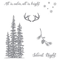
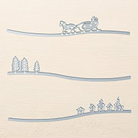
When I saw the Wonderland Stamp Set and the Sleigh Ride Edgelits I was smitten! I love Christmas and all the nostalgia of Christmas Past. I also love nature so I just had to try this color combo with two of my favorite stamping supplies to see what it would look like! The color combo is Mint Macaron, Mossy Meadow, Soft Sky, Lost Lagoon, and Basic Black (Archival). This was also a Make & Take at my Grand Annual Open House this year! In case you missed it, I posted a video about the Sleigh Ride Edgelits here.


For your convenience I’ve included a product list of the items used to create this card below. To add any of these items to your stamping collection you may click on one of the products or the Shop Now tab above to be taken to my 24/7 online store! Thanks so much for stopping by!

Gorgeous Color Combos Create Impact

Color combinations can make or break your crafty creations. Even a soothing color combination like this one can have big impact. Color can evoke feelings, memories, stimulate, etc. There is a whole physcology of color! I love nature; it soothes me. This color combo “spoke” to me. I wanted to use it in my card making. Check back in a couple of days and I will show you how I used this color combination! Thanks for stopping by!

You’ve Got This with Archival Ink

You’ve Got This with Archival Ink
You’ve Got This Stamp Set • Kraft and Shimmery White Cardstock • Cherry On Top Designer Washi Tape • Basic Black Archival Stampin’ Pad® • Calypso Coral, Crushed Curry, Early Espresso, Garden Green, Soft Sky and Tangelo Twist Classic Stampin’ Ink® Refills • Linen Thread • Aqua Painters®


Archival Ink is permanent and perfect for watercoloring techniques. Use archival ink pads to stamp your images, and then use Blender Pens or Aqua Painters® to add color.  Our new Basic Black Archival Ink Pad will be available to order on September 1st!

What is Archival Ink?

Archival ink is an ink which is designed to resist fading and weathering. In order to endure over time, an ink must have two main properties. One is the ability to resist fading. Over time, many inks start to slowly fade away, first turning brown and then later almost disappearing completely. Remember the difficulty we had with our past Basic Black ink changing color so fast and not looking black?  Secondly, an archival ink must also remain fast to the page so that exposure to moisture will not cause the ink to run. This is what makes an archival ink ideal for watercoloring.
Archival inks can be dye inks or pigment inks. Pigment ink is permanent, colorfast, stays bright, and is durable, but does not dry quickly making it necessary to heat dry with our embossing guns in our card making. Our new archival ink is dye based and will dry quickly on your card. Dye based inks will remain colorfast for only so long, but most are strong enough to last a few generations so you won’t have to worry about your creations fading into oblivion right away! They will bring pleasure to your recipients for many years to come!
To purchase any of the items to make this card, click on the Shop Now button to be taken to my online store!
Thanks for stopping!

June Color Combo

Here is the color combo for June in anticipation of our new core colors! This is very soft and pretty! If you don’t have the Pink Piroutte you could substitute Pretty in Pink although it is a little brighter. Have fun playing with this color combo!

Color Renovation – A Fond Farewell!

Color Renovation

Stampin Up! recently announced their upcoming Color Renovation.  To stay up to date with current color trends, some colors will be retired, some old favorites from past “In Color” collections are joining the core collections, and some brand new colors will be introduced.
Click on the title to this post to see the pdf chart of colors that will be retiring. Now is the time to check your stash and make sure you stock up on your favorite colors before they retire….especially if you are using them for a project like invitations or memory books!  They will be available until the end of June – but don’t wait or they may run out of stock!
Check back! I will be posting the new color collections next!

Saturday Sketch

Here is a card sketch that I created just for you in My Digital Studio. The color combo is included! The colors are Pretty in Pink, Certainly Celery, So Saffron, and Bashful Blue. (Yes, I am “thinking spring” already! lol!) I hope you have set aside a few hours to have fun stamping this weekend. Have a great one!

Saturday Sketch

Here is a card sketch to get you started on your card making this weekend! I created this sketch is My Digital Studio so, while I was at it, I created a sample and I gave you a color combo! The color combo is Kraft, Real Red, So Saffron, and Night of Navy. Have a great one!