As promised, we are still exploring the idea of what makes a perfect card. You can see the orignal post by clicking here. This is essentially the same card layout with a different color combo and stamp set. You can visually see that the tone or the mood of the card is different.
Design element is also key to a perfect card. In design, oddly enough, it is odd numbers that bring balance. The Rule of Thirds/Threes is most commonly known, but groupings of five, seven, and nine also work well.
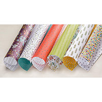
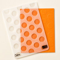
On this card layout, seven of the large polka dots have been highlighted with designer series paper. Three of the seven pieces of designer series paper are the same (I brought the rule of three into my group of 7). I chose the brightly, multi-colored pieces for my three of the seven so I could use those colors in other areas for the card. The other four pieces are pairs of two different colors and patterns.
This grouping of seven designer series dots creates a pattern and makes the card visually appealing. I pulled the brightest color from the designer series paper to be my accent/embellishment with the Baker’s Twin to give the card a nice POP of neon color which happens to be a trend right now.
If I wanted to make the pattern stand out even more, this designer series paper has a patterned Calypso Coral sheet which could be used in place of the more subtle Lost Lagoon. I haven’t tried that yet to see if I like it. It may be a little too much for me. However, if you like really bright and cheerful cards, you may prefer it to be a little bolder!
As you can see by comparing yesterday’s card with today’s card, this design is very easy to duplicate. I have several more stamp sets and designer series papers that will make great cards with design!
For your convenience, I’ve shared the supplies used in making this card below. Click on any of the supplies used to be taken to my 24/7 online store to buy the supplies you need to create this card. Thanks so much for stopping by!